Designing for someone already on the phone.
Leumit is one of Israel's four national health funds. I spent close to three years on their operational core system — the platform that call-centre agents, clinic reps, and managers use to actually do their work. This is a case about designing for people whose screens aren't a workspace but a second ear: what has to change when every interaction is happening in parallel with a live conversation.
The phone rings before the screen loads.
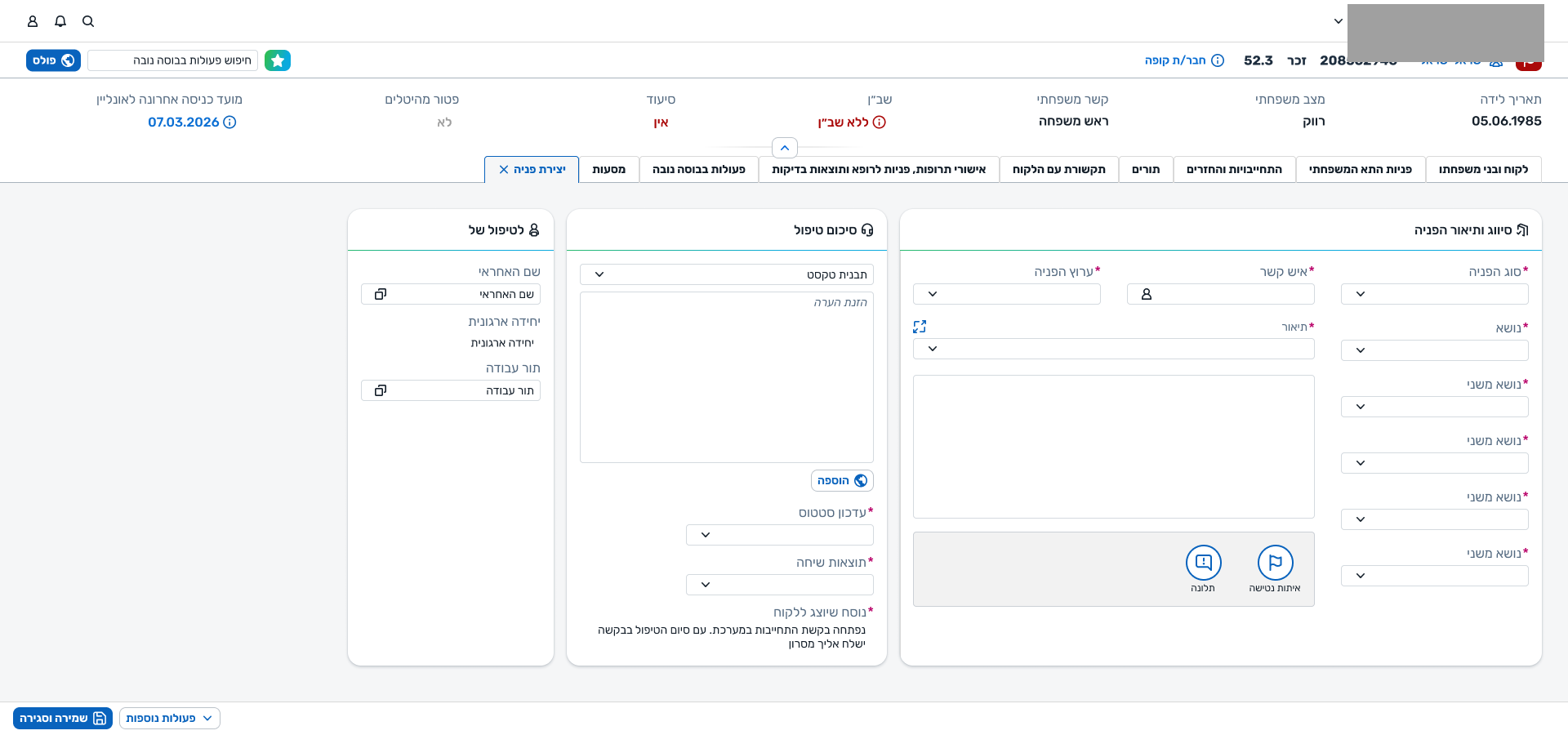
A member of Leumit calls in. An agent picks up, and the system has to keep up. The same is true at the clinic: a rep pulls up the member's details through a search screen while the member is already at the desk. The legacy tool made that hard — new hires faced a long climb into it just to get through their first shift. I was brought in to design the replacement: not to modernise the visual, but to make an operational platform that could actually be used in real time.
We're designing for someone mid-conversation.
Almost every design decision on this project — the ones that looked small and the ones that looked structural — traced back to one underlying user. Not a generic knowledge worker. Not a power user at leisure. Someone under real-time pressure, with another human waiting.
Five surfaces, two origins.
The platform is made of a handful of surfaces that together form a complete operational workspace. Some existed before I arrived, and I worked on them in a maintenance-and-extension mode. Others I designed from scratch — the surfaces where the bulk of the thinking and the iterations lived.
Customer 360
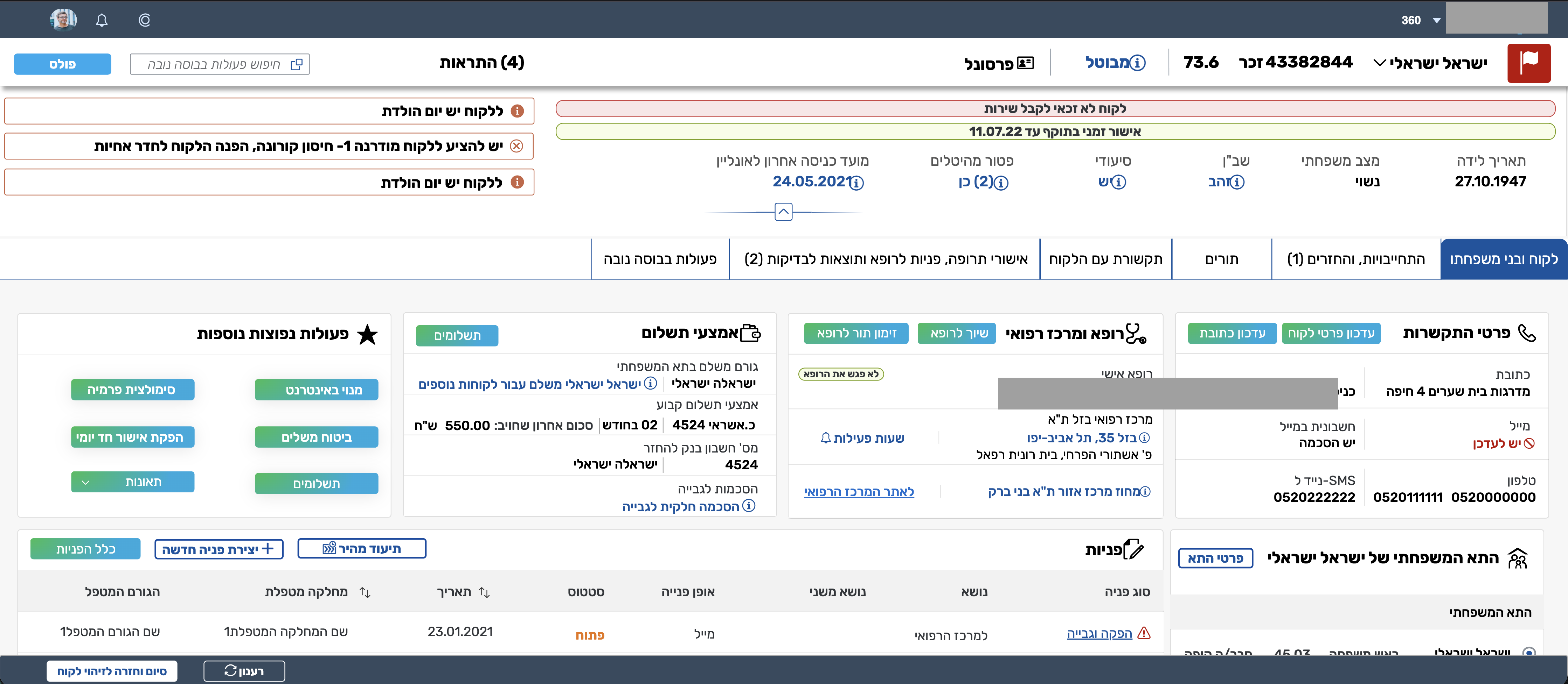
The member record. It was the system's most mature surface when I arrived — the thing with the most volume and history. My work here was to rebuild its visual on the new design system and to make small structural refinements along the way — relocating the alerts from top to bottom, for example — but not to re-architect it.
Request, Creation, Workboard, Dashboard
The Request object (full view and Quick View), New Request Creation (full and Quick Create), the agent Workboard, and the manager Dashboard. This is where most of the page will live.
Everything hangs on the request.
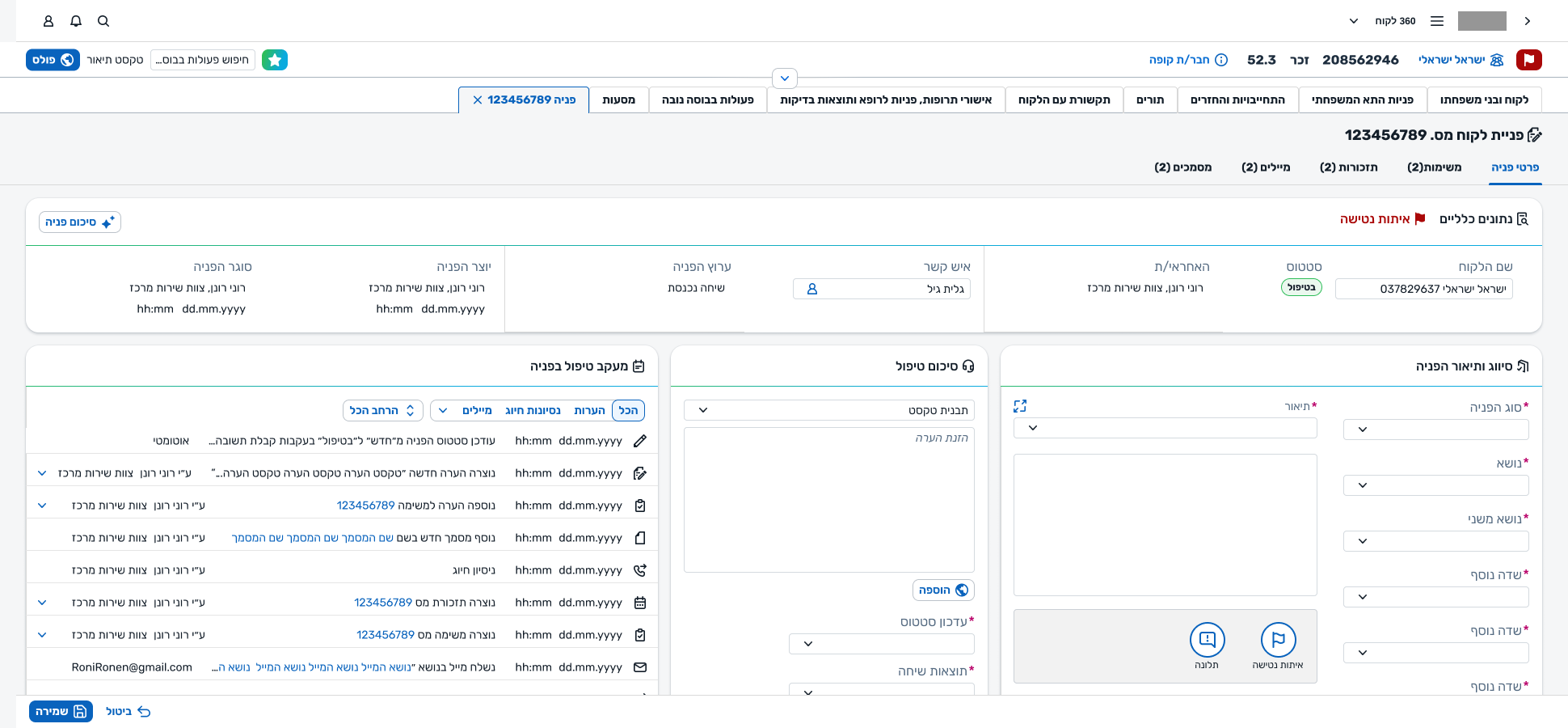
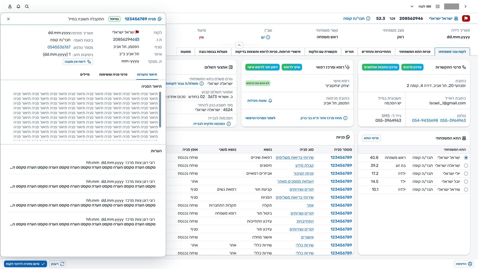
If the member is one hub of the system, the request is the other. Every action an agent takes resolves, in the end, to a request — one they opened, one they're continuing, one they're handing off. The shape of that object, and the way it behaves, was the biggest piece of work on the project.
4AThe mental model
The system has two mental anchors. On one side, the member — who they are, what they have, what they've had. On the other, the request — why they're calling right now, what needs to happen, who owns it. Every other entity in the system — tasks, reminders, emails, documents — hangs off one of those two.
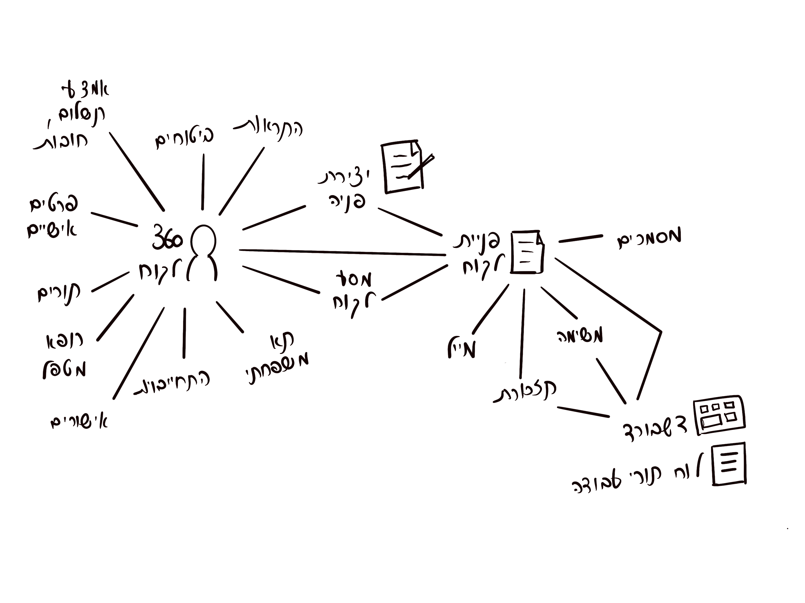
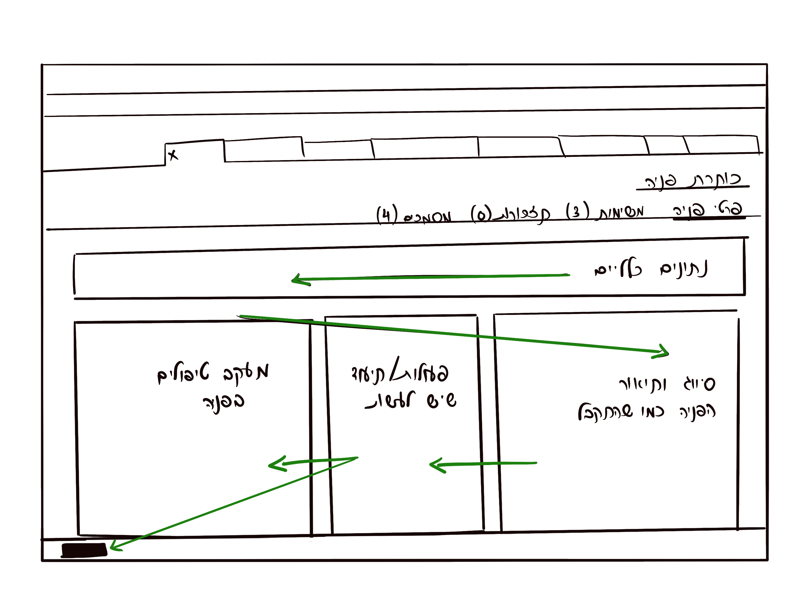
The request itself answers three questions, and that's what gave the page its layout. What came in (the classification and description as the member presented it). What's happening now (the current state of treatment, documentation, summary). Who owns it (the responsible agent, team, and center). Past, present, responsibility — three panels.
4BCreation mirrors the record
A request is created during a conversation and returned to, sometimes days later, by a different agent. Those two moments had to feel like the same object. Early on, they didn't: the creation screen and the view/edit screen had grown up with different categories, different field orders, different language. Agents had to translate between them.
We rebuilt both together. Same fields, same labels, same order, same grouping. The sticky-note round that follows is where we worked out the alignment — two layouts side by side, physically, until they matched.
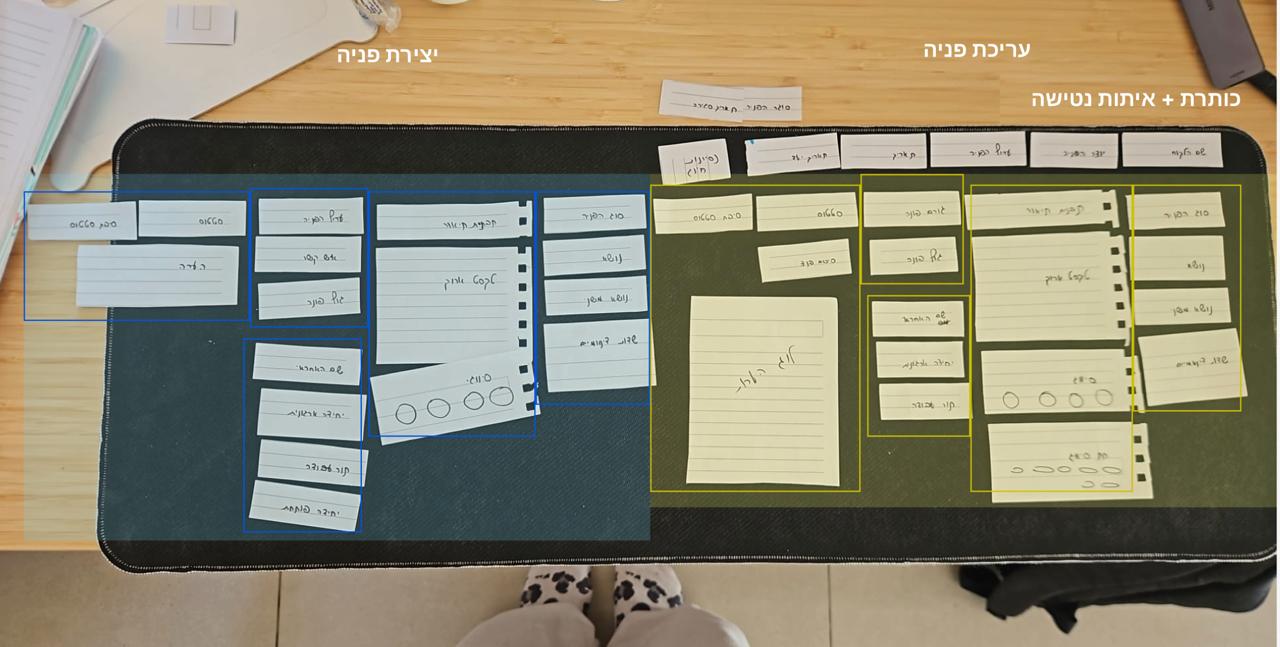
Once the two screens shared a layout, the rest of the system's grammar fell into place. A field meant the same thing wherever it appeared. An agent who'd opened a request recognised it six tabs later.
4CReleasing the wizard
The legacy creation flow was a four-step wizard: classify, add context, document, assign — each behind a Next button that wouldn't let you move on. We inherited that. For a while we argued for it — a guided flow, consistent, hard to get wrong. Over nearly two years of field work with different call-centres and edge cases, we stopped arguing.
The wizard worked for one call shape. Real work didn't fit. Forcing a sequence — or forcing every field to be filled — didn't make the work safer, it made it impossible. We replaced the wizard with the three panels: any order, partial saves, no forced next.
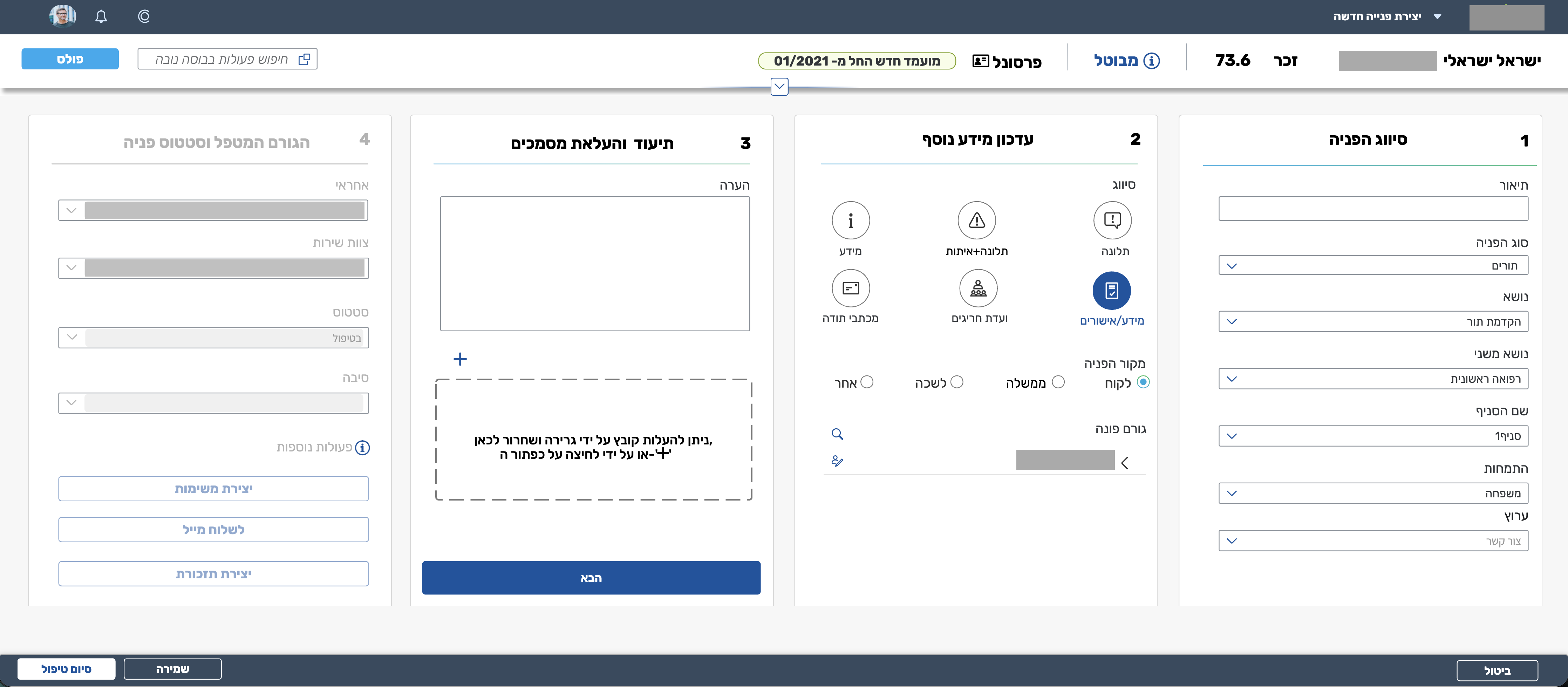
The shift wasn't aesthetic. It was a concession to how calls actually go — and to how much of the work, in a call-centre, is partial.
Work that belongs to a request, but lives in its own rhythm.
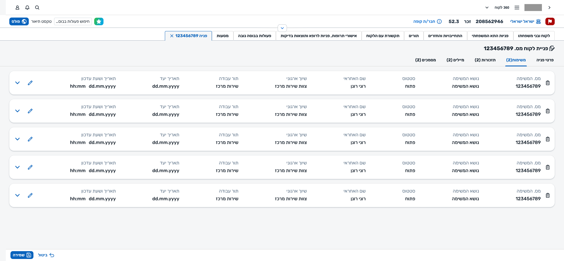
The earlier model treated everything an agent did inside a request as a flat list of treatments. A phone call back, a document review, a referral follow-up, an internal clarification — all the same shape, distinguished only by free text.
But the work didn't behave flatly. Some actions were open items: things that had to be done, assigned to someone, with a due date, that could be reassigned, completed, or escalated. Others were events: things that had happened, that needed to be recorded. Collapsing the two created a queue that nobody could read at a glance — you couldn't tell what was still owed from what was already done.
We introduced tasks as a first-class entity on the request. Tasks have an owner, a state, a due date, and a place in the workboard. Events stayed as log entries. Once the two were separate, the request got a Tasks tab alongside the other related entities, and the workboard finally had something sensible to show.
Quick View, Quick Create, Full — and an AI summary when the context is long.
Not every moment needs the full request surface. Sometimes an agent just needs to glance at a request, answer a quick question, and keep going — without leaving the member's record. The same object had to appear at different intensities.
Glance — a request, without leaving the member.
Opens as a side panel from the member's record. The request's essentials in a scannable shape — enough to answer, not enough to get lost in.
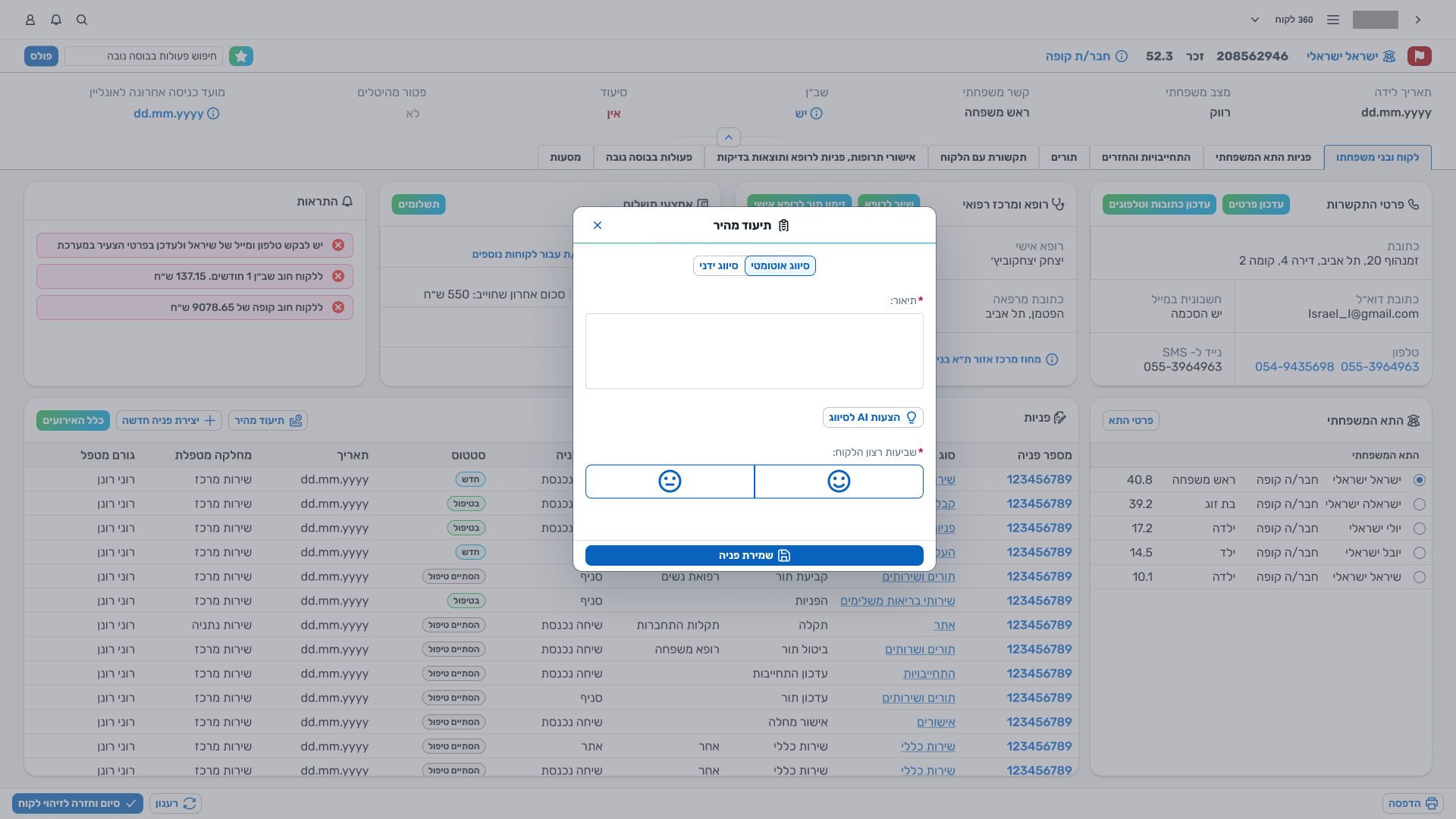
Log — a request in under a minute.
A condensed creation modal for the most common patterns. The minimum set of fields needed to open a request responsibly, captured in under a minute.
Work — the whole request, with everything it touches.
Three panels, tabs for related entities (tasks, reminders, emails, documents), the full log. Used when the agent is actually on the request, not glancing at it.
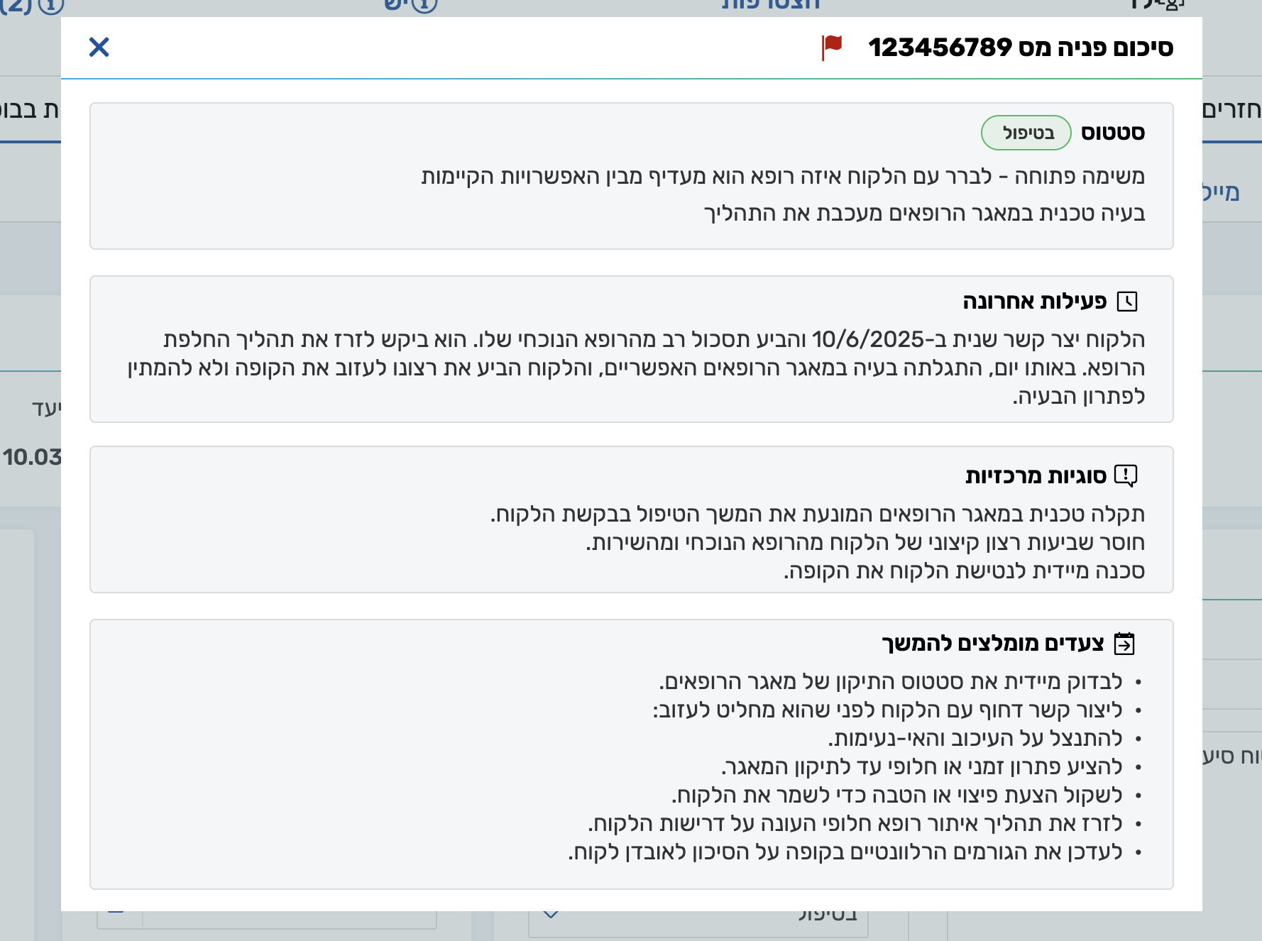
The system also has an AI-generated request summary that an agent can trigger on a request that isn't theirs — a manager checking why a certain request is stalling, or an agent who's just stepped into a case that wasn't opened by them. The logic is the same as Quick View: absorb context fast, so the next step can happen without reading everything.
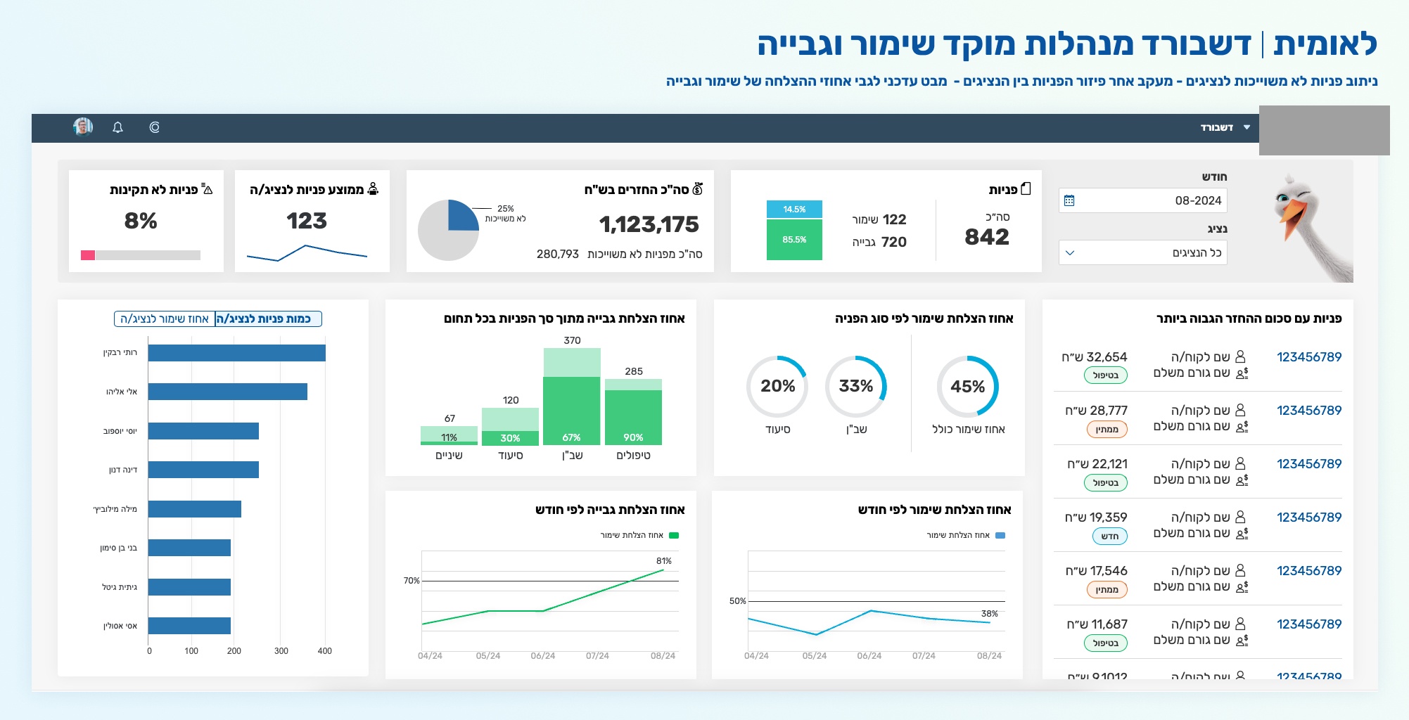
Where agents see their day — and where managers see the floor.
Requests don't live alone. Agents work from a workboard that shows their open tasks; managers open a dashboard that rolls up what's happening across the centre. Both surfaces exist to give the request context — to make the individual call part of a day, and the day part of a centre.
Not every decision was a design decision.
A lot of what the system looks like today is the residue of pressures that had nothing to do with UX. Naming what they were is how the work honestly gets told.
SAP underneath
The platform sat on top of an SAP backbone. Entity shapes, lifecycles, and permitted transitions were negotiated with what SAP could actually persist. Many rounds of design were not about what the user needed, but about what the backbone would let us express.
Multiple centres, one system
The platform serves several call-centres whose work looks quite different on close inspection. Pulling them into one generic system required absorbing each centre's lexicon, flow, and exceptions — and then not building the union, but the useful intersection.
Organisational politics
A real-time operational platform touches a lot of teams with a lot of interests. Some rounds of the design existed to make a stakeholder comfortable, not to make a user faster. I name those rounds as such, rather than retrofit them into design rationale.
Iterations we kept, iterations we lost
Many versions of the request, the creation flow, and the log existed — some of them are in this case. Others never shipped. Working on a system for three years means most of the best design is invisible in the final screens; it's the wrong turns that didn't get taken.
The log, re-seen.
The system keeps changing. The design system was refreshed recently, so the most recent screens look different from last year's. The request object got a new log component. This is the kind of project where the final artifact is a habit of iteration, not a single screen.
The log is a small but representative example. A version we proposed earlier to the client was a side-panel timeline, opened on demand — chronological, detailed, a dedicated surface for history.
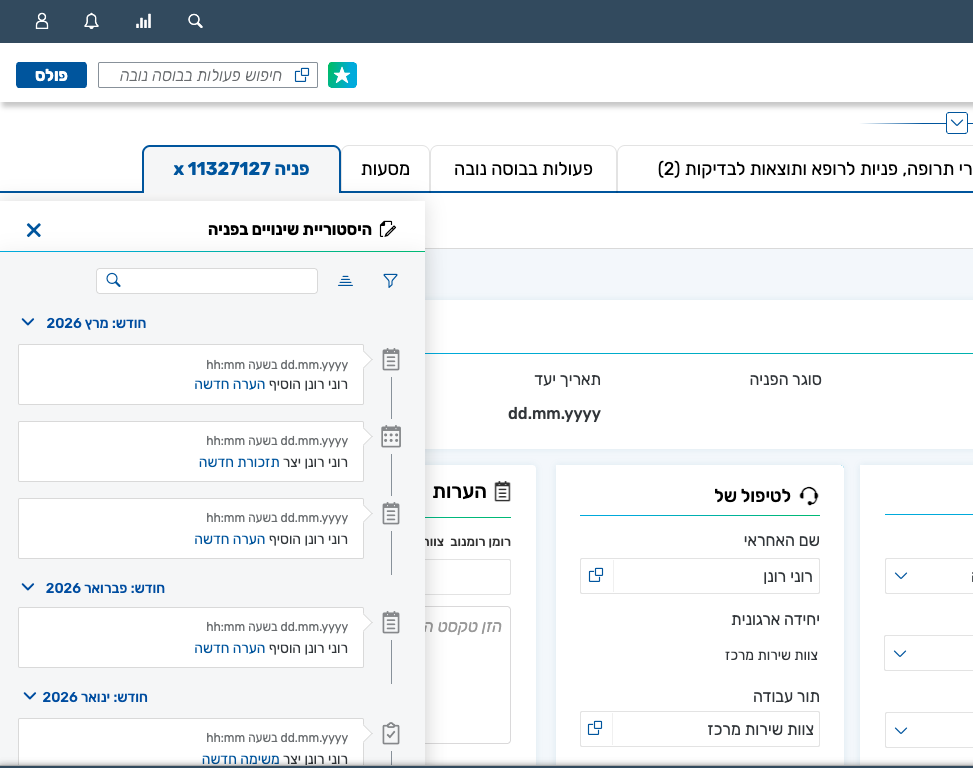
In the end we went the other way. A more central component, inside the layout, that didn't hide the rest of the request — and that the agent could scan, rather than read in sequence.
The version we shipped is a table, not a timeline. It doesn't hide anything; it can be scanned at a glance. Maximum information, minimum time.
The log stopped being a dedicated surface and became a working component — alongside the agent, not in front of them.