Giving the warehouse a queue it could see.
A paper-based dispatch process was cracking under its own volume — no one could tell how many open requests existed at any given moment. I was brought in to digitize it. The real work turned out to be conceptual.
A dispatch process struggling on volume, visibility, and errors.
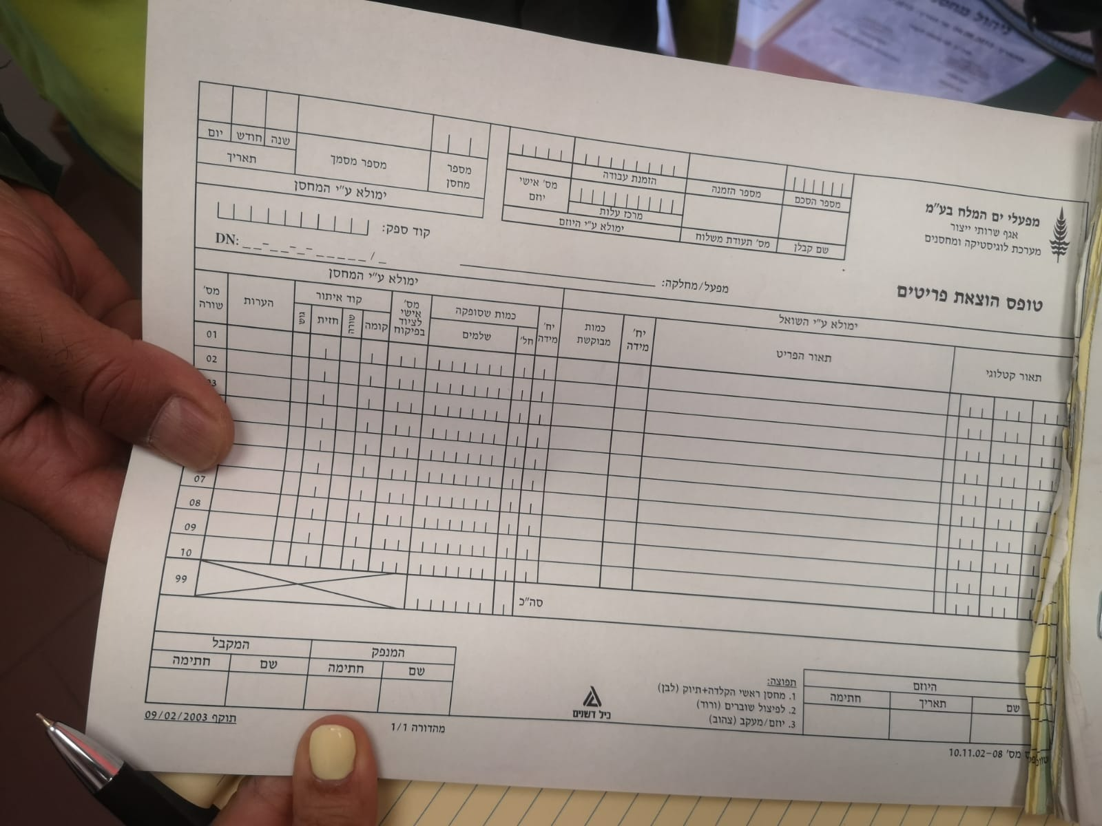
Employees across the company submitted internal requests for tools and operational equipment. Those requests landed in the warehouse as yellow printouts on a dedicated printer. Warehouse workers picked the items off the shelves, typed the order number into a computer, marked items as collected, staged the packages with the yellow page attached, and at handoff scanned the signed white copy into the digital archive.
By 2022 the process was cracking. No one could see how many open requests existed at any given moment. Items were picked twice. Requests stayed staged but forgotten. Employees arrived to collect pickups that were still in the queue.
I went to the site before I drew anything.
I spent a full day in the warehouse — talking to the department manager, talking to multiple workers in some areas, watching operators pick and stage, photographing the papers in motion.
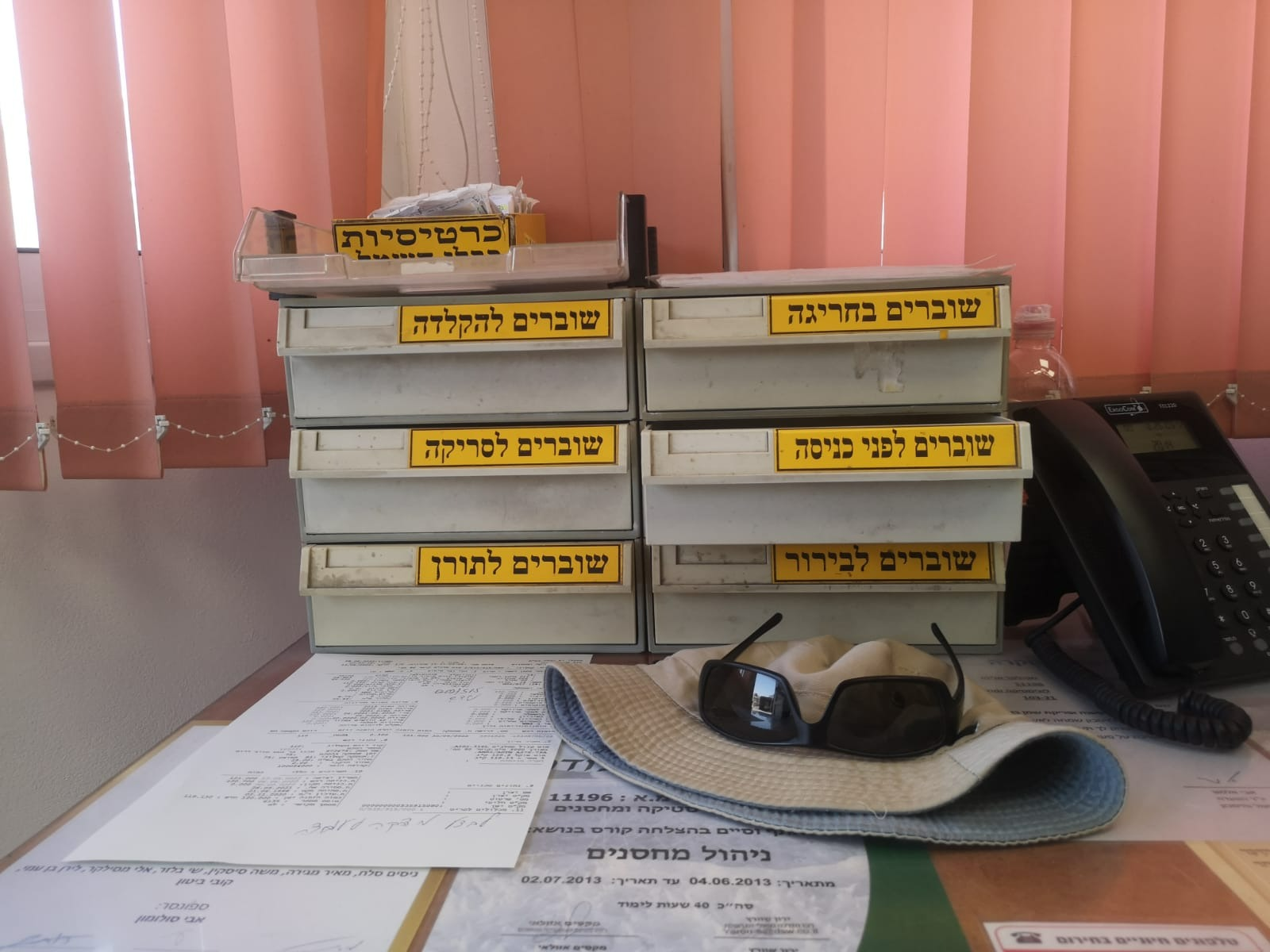
What I saw was that the paper wasn't an input to the process — it was the process. Compartments along the wall sorted stacks at each stage. A quiet infrastructure had grown up just to keep the paper itself ordered.
My job was to make the paper unnecessary. To take physical tracking and archiving off the team's hands, and to design out the mistakes so they didn't have to spend energy guarding against them.
The system had no discrete unit of work.
The existing model treated each warehouse relationship as a single living record — a standing reservation where the requester added items over time and the warehouse subtracted them as they were dispatched. It tracked running balance, but it had no unit of work. No way to say "this specific pickup is now in progress," or "this handoff just happened." The paper existed precisely because the system couldn't represent discrete events.
The shift was to introduce a new, discrete entity — the picking request — living alongside the standing reservation. The reservation kept doing what it did. But every time the warehouse had to actually fulfill something, a picking request came into existence with its own lifecycle: created → staged → handed off → closed.
That one split turned continuous state-change into trackable events. The warehouse suddenly had a queue they could see. Almost every downstream improvement — counters, statuses, handoff records, visibility into load — flowed from it.

The first answer from the technical team was "not possible."
Introducing a new entity into the existing architecture was not a small ask. The first reaction from the ERP implementer and the developers was that it wasn't possible — the standing reservation was the only object the system supported.
I pushed back. I knew this was the only way to give the warehouse a queue they could see. Without it, every fix downstream would be cosmetic.
Over two days, I sat with everyone the decision touched — the ERP implementer, the developers, the department manager, and the IT systems lead. We mapped every edge case. Eventually a technical path emerged — a specific printing mechanism that made the new entity implementable within the existing architecture.
Almost every good thing in the final system traces back to that "yes."
The job of a product designer isn't only to design screens — it's to understand the system well enough to name what's missing from it, and to stay in the room until the missing thing is built.
A walk-up exception
Most picking requests originate upstream — an employee files a request in SAP from their desk, and the warehouse only dispatches it. But sometimes someone showed up needing an item on the spot, without having filed anything. For those cases, we added a quick creation path for the warehouse staff: scan a standing reservation, pick a few items against it, confirm. These walk-ups tended to be short and simple, and the short flow kept them from breaking the main rhythm.

A tablet for the floor, a desktop for coordination.
The tablet travelled with the picker. We designed around a mount installed on each picking trolley — the worker placed the tablet on the cart, pushed it through the aisles, and kept both hands free for the items themselves.
Scan as you collect. Instead of hunting down the right row on the screen and ticking it off, the worker scanned the barcode on each item as it went into the trolley. The system found the line, marked it, and only asked for input when the quantity had to be adjusted. Fewer taps. Less second-guessing.
Designed for rough hands. Tap targets were sized generously — buttons, rows, the scan affordance. Warehouse work is physical: gloves, dust, heavy stock. A precision-friendly interface would have failed on day one.
The floor team wanted this. The workers weren't reluctant — they asked for tablets. They'd felt the paper process fail them, and the tablet was the promise that they'd stop carrying forms around the aisles.
One process for several warehouses. A real challenge was designing a single flow that would fit several warehouses with different habits and conventions. The architecture had to be generic enough to carry all of them without sprouting special cases for each.
The desktop mirrored the tablet — same data, same actions, so a coordinator could review, reassign, or monitor load without leaving a trail of out-of-sync state between surfaces.

The warehouse wasn't a single place, and orders weren't a single kind.
"The warehouse dispatch process" was actually a family of related processes — two locations, three order rhythms, each flexing the same underlying model in a different direction.
A main warehouse for standard items. An external warehouse for bulk. Large equipment lived off-site, where a truck was often physically parked at the loading bay while the crew prepared the delivery. Response speed wasn't a nice-to-have; it was the whole game.
Three rhythms, three kinds of demand. Standard orders, picked up whenever. Scheduled orders sent via outbound shipment twice a week. Urgent same-day orders that had to jump the queue. The queue view had to make these distinguishable at a glance.
Getting the abstraction right — a single picking request that could carry all three contexts without special cases — meant the system bent without breaking.
Small moves that pulled paper out of the loop.
Once the flow was agreed, I worked through the smaller decisions that determined whether the system would actually replace the paper — not just sit next to it. Each of these solved a specific failure mode I'd seen during the day in the warehouse.
Barcode stickers on the package, not a yellow page beside it
The old process attached a yellow sheet to every staged package. I replaced that with a barcode sticker applied directly to the package, carrying the picking request ID. No paper in motion around the staging area, and handoff became a scan instead of a hunt through forms.
Digital signature at pickup
Archiving was already digital — the white copy of the signed form was scanned and filed. What changed is the signature itself: captured directly on the tablet at handoff, closing the loop without the paper round-trip.
Budget check at submission, not after picking
In the old flow, a missing budget allocation surfaced only after the warehouse had already picked the items — wasting their time on a request that couldn't be released. I moved the check to submission. Requests without budget never consumed warehouse effort.
Locking a request during picking
Previously, two operators could unknowingly start picking the same request in parallel. The new system locked an active request to the worker picking it, making duplication structurally impossible.
Keeping a print path — on purpose
In the early rollout, I kept a print branch in the flow even though the target state was fully digital. A warehouse doesn't switch overnight. Giving the team a familiar fallback made the transition feel safer; the branch was designed to atrophy as trust in the digital flow built.
Surfacing alternative stock when the shelf is short
Mid-pick, the system says "not enough here." The new flow surfaces alternative availability in context: other warehouse locations that hold the item, and stock that's been received digitally but hasn't yet been placed on the shelf. The worker keeps moving instead of hitting a wall.


The system shipped. I moved on before I saw the full rollout.
Mockups were approved, development began, and I transitioned to other projects in the same client portfolio before full production. The honest version: I designed the system and aligned the stakeholders, but I don't have rollout metrics to quote. What I heard was that the team saw the project as a win.
A design system that outlived the project it was built for.
One of the parts I'm proudest of isn't a screen. Building the dispatch system meant building the first design system for this client's internal operations tools — tokens, components, patterns. Across the following years, the same system carried across at least five more internal operations products:
Inventory counts
Handheld terminals on the warehouse floor.
Field defect reporting
Mobile app for technicians out in the field.
Warehouse goods intake
Tablet workflow for receiving incoming stock.
Contractor diary management
Desktop system for on-site contractor scheduling.
Attendance system
Web product rolled out for one of the client's international sites.
The consistency meant the team didn't start from zero each time, and operators moving between tools felt at home. The foundational choices made on the dispatch project had to scale — and did.