Redesigning the Seder, not just the Haggadah.
It was the first Seder I hosted in my own home, and I wanted everyone to enjoy it — kids, parents, grandparents. That meant rethinking the evening itself, not just turning the Haggadah into a screen.
A long, text-heavy evening with very different people around the table.
The Seder is one of those rare family moments where four-year-olds and eighty-year-olds read the same text together for three hours. In practice, the kids lose focus, the Seder leader loses the room, and the adults who want the traditional text find themselves the only ones still reading.
I'd watched this happen at other people's tables for years. Hosting my own Seder for the first time, I didn't want to just replicate it. I wanted a Haggadah that could hold the attention of the whole table — without taking the ritual out of it.
Design the evening, not just the screen.
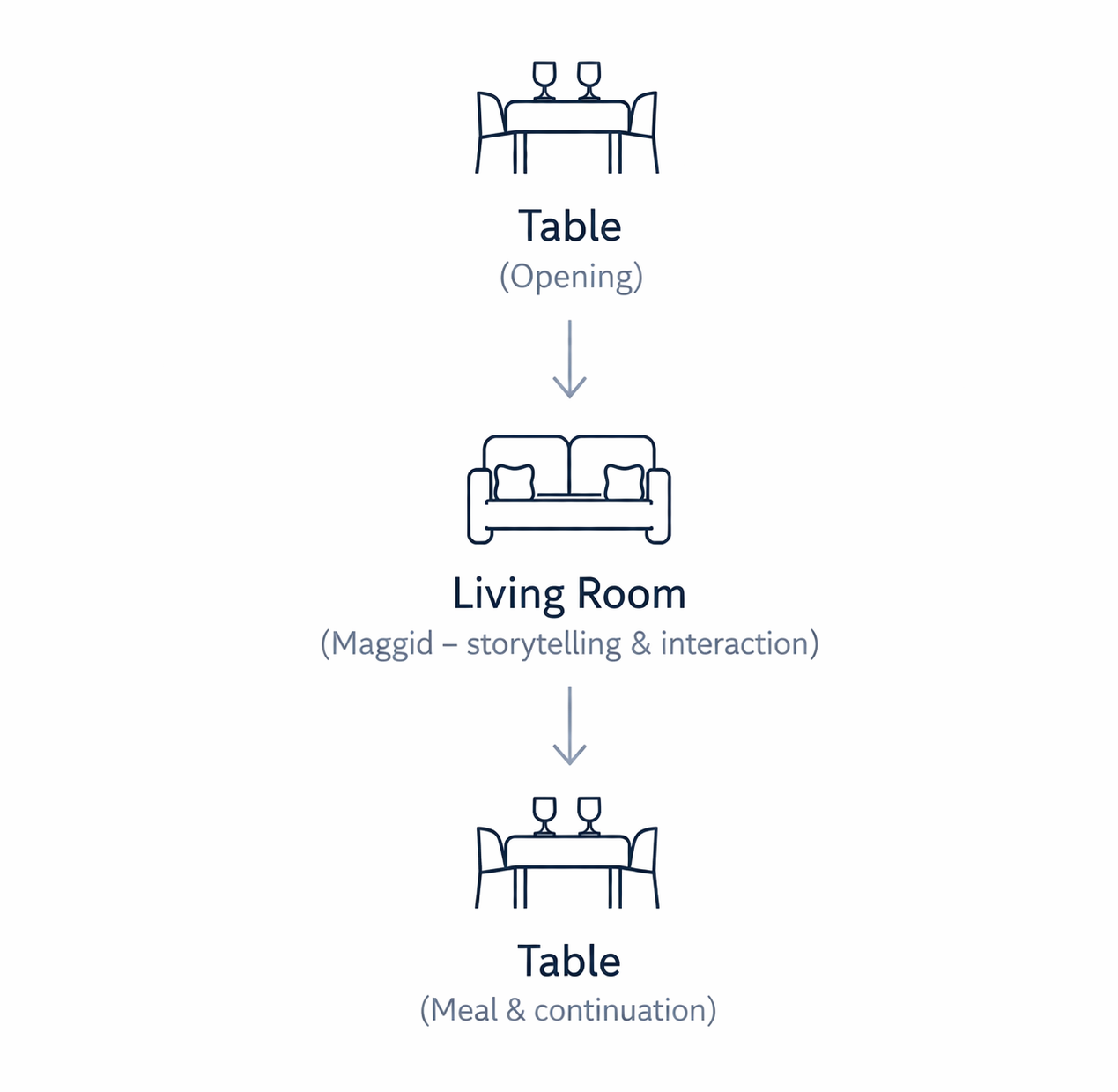
The obvious move was to build a prettier digital Haggadah. But the problem wasn't the book — it was the flow of the evening. Three hours of the same posture at the same table is what drains people, not the text.
So the first design decision was physical: move the Maggid section — the storytelling middle of the Seder — to the living room, on softer seating, closer to each other. Come back to the table for the meal. The screen had to support this motion, not fight it.
One shared screen, printed Haggadot beside each plate.
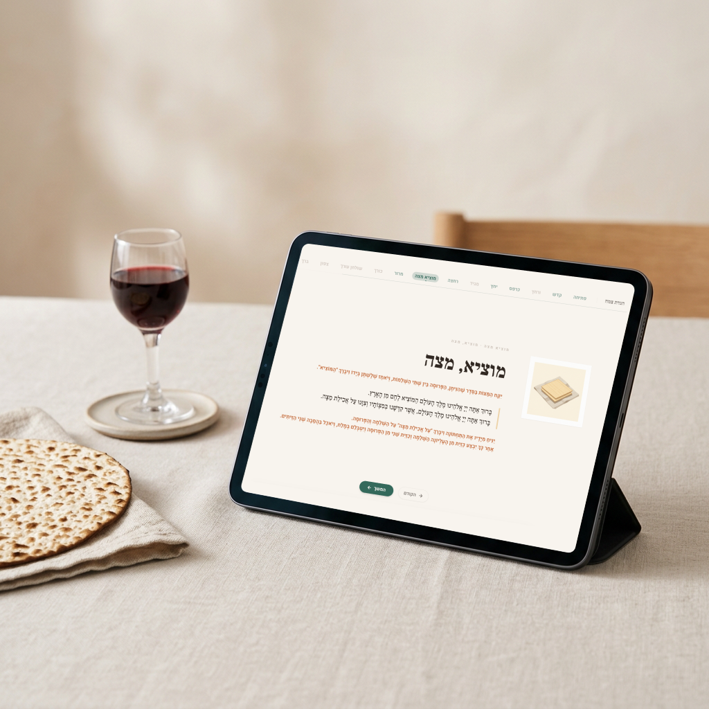
I set a computer monitor at the center of the table — big enough that everyone could see it without leaning in — and that drove the experience for the group: visuals, transitions, the current Seder stage. Next to each plate, a printed Haggadah for anyone who wanted to read along or hold something in their hand.
This kept the ceremonial feel without asking anyone to stare at their own device during a family dinner. The screen became the shared focus; the printed copies respected how people already like to do this.
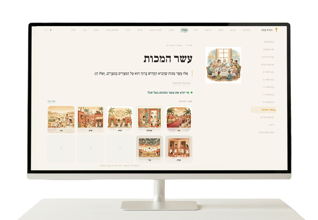
Step-based navigation, expandable text, visual anchors for the big moments.
The interface is built around the 15 stages of the Seder. You always know where you are and what's next. The traditional text is there for anyone who wants it, but collapsed by default so it doesn't dominate the screen.

Giving people roles to play inside the story.
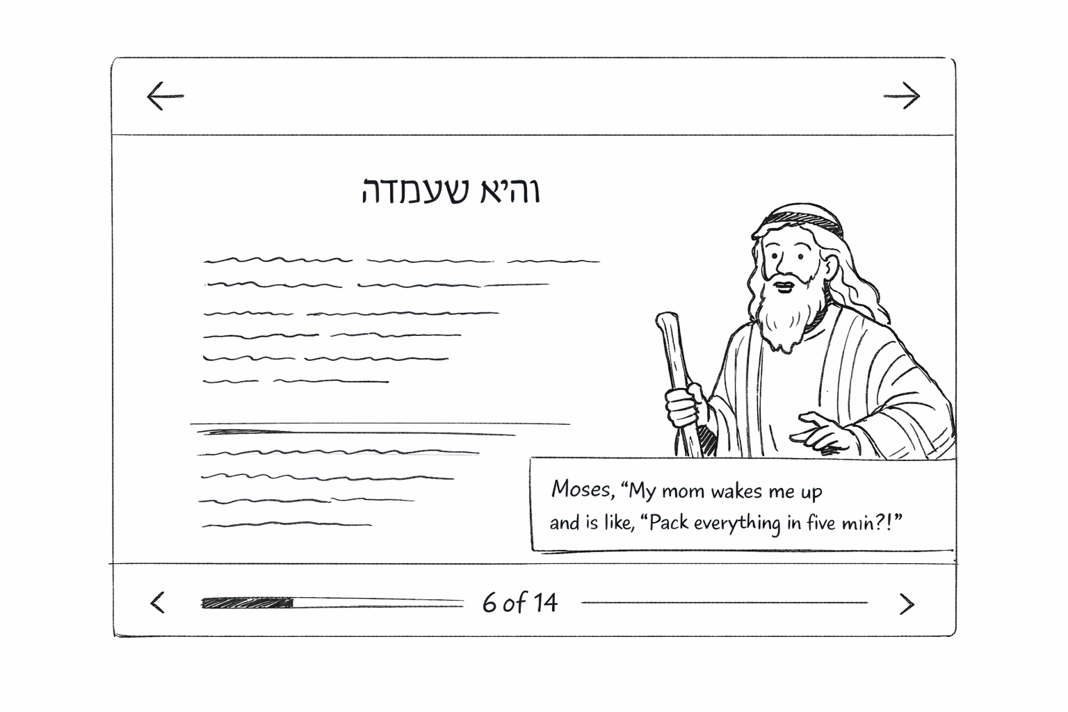
Instead of presenting the Haggadah as an uninterrupted wall of text, I brought the characters from the story onto the screen — Moses, Miriam, the Four Sons — interjecting with humor, a modern aside, a question back to the table.
The design payoff went beyond comic relief. Each character's lines became parts people at the table could read — a light role-play layer on top of the ritual. Kids especially got pieces that were actually fun to deliver, instead of only getting handed the densest passages of the traditional text. The ritual still belongs to whoever is leading, but the screen hands out small roles everyone can step into.
The real UX work happened before I opened any tool.
Before writing anything, I sat with my dad and went through the Haggadah together. What had to stay exactly as written. What could be shortened. What he'd be willing to skip if the kids were fading. What was non-negotiable for him to hear read aloud.
That conversation shaped the whole content strategy. It's easy to "redesign" a ritual text when you don't have to explain the cuts to the person at the table for whom the tradition matters most. Doing it with him in the room kept the project honest.
Through the three days of building I kept going back to my parents with ideas as they came up — a new flow, a section I wanted to shorten, a character I wasn't sure about. The question was always the same: is this still the Seder you want to pass on to your grandchildren, or am I making it too short, too inventive, too far from the feeling? Their pushback kept the design from drifting into something clever but disconnected.
Three days, two tools, one strong product direction.
This was my first serious attempt at building a real product with AI tools end-to-end. The loop was short and iterative:
ChatGPT — exploration
Brainstorming needs and constraints, drafting content from multiple Haggadah sources, shaping the tone, writing the initial Base44 prompt.
Base44 — building
Iteration loops on flow, structure, and interactions — getting something clickable fast.
Back to ChatGPT — second pass
Adding the characters, improving transitions, rewriting segments for clarity.
Back to Base44 — integration
Bringing structured content back in, aligning visual style, adding illustrations.
AI dramatically compressed the exploration phase, but it does not replace product judgment. Everything good about this project came from strong direction, curation, and knowing when to throw things away.
The actual test: eleven people, one table, three hours.
I ran the Seder with my family — kids, parents, siblings — with the monitor in the middle of the table and printed Haggadot around it. I watched what made people lean in, what made them lose interest, and where the flow broke.
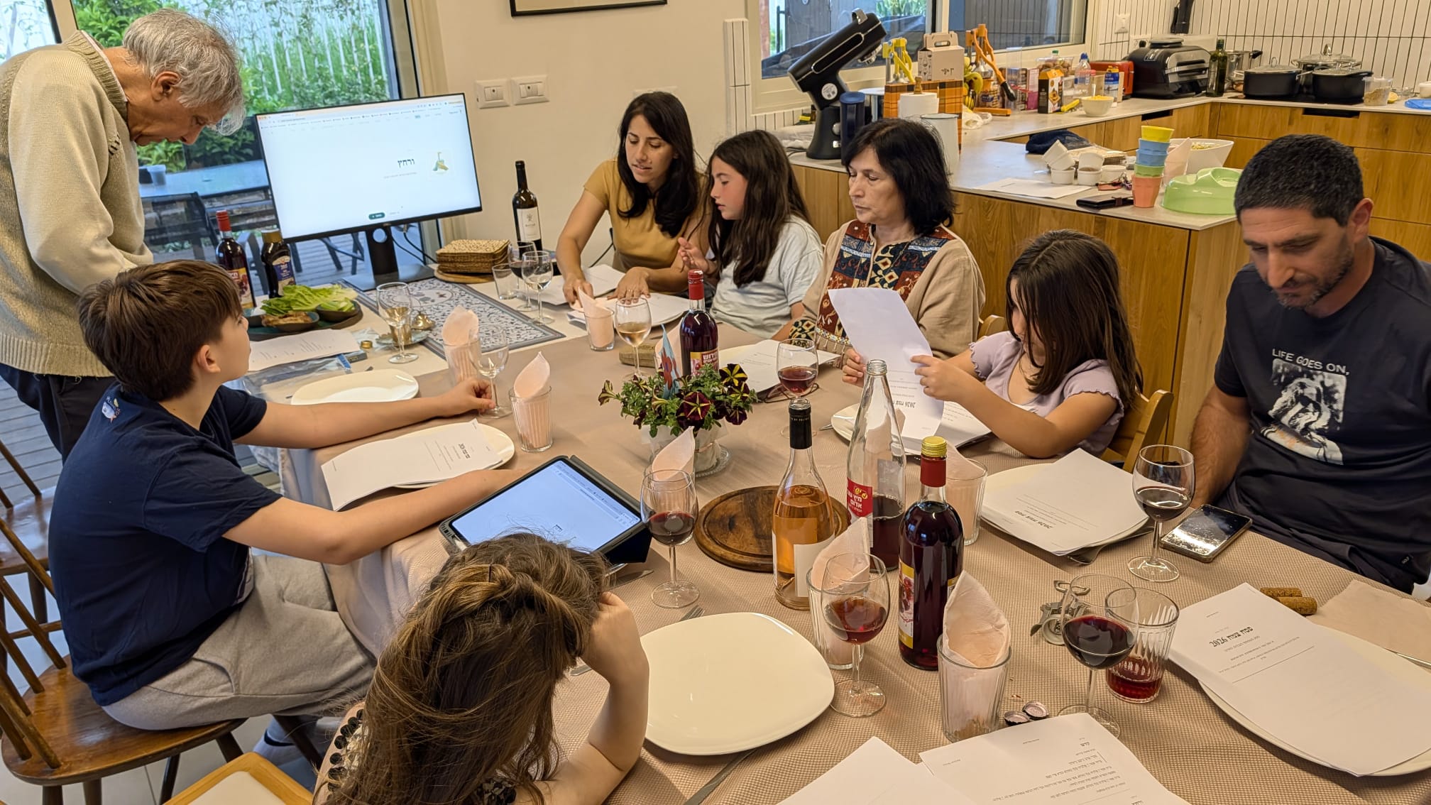
The table stayed engaged through most of Maggid. There was real enthusiasm and involvement for a meaningful stretch — until the kids faded toward the end of it, which is also where the traditional Seder loses them anyway. My dad brought his own traditional Haggadah and read from it instead of from the printed version I'd laid out — he needed that anchor, the book he always uses, and that was fine. Part of the design was that no one should be pushed out of their comfort with the ritual.
At the end of the evening I asked everyone what worked better and what worked less well, and wrote it down alongside my own observations from the night. That became the roadmap.
Six things I took into the roadmap.
For next year's version, I'm planning to bring in help from the household itself — two illustrators and a chief of creative at a gaming studio all happen to be in the family. Their craft is exactly what the visual and animation layer needs to lift it out of first-draft territory.