A friendly companion for the desk-bound day.
ErgoFriend is a desktop app that protects your back and your attention — scheduling micro-breaks, leading quick stretches, and checking in on your setup. A personal project where I let the visuals lead.
Stretch the body, stretch the design muscle.
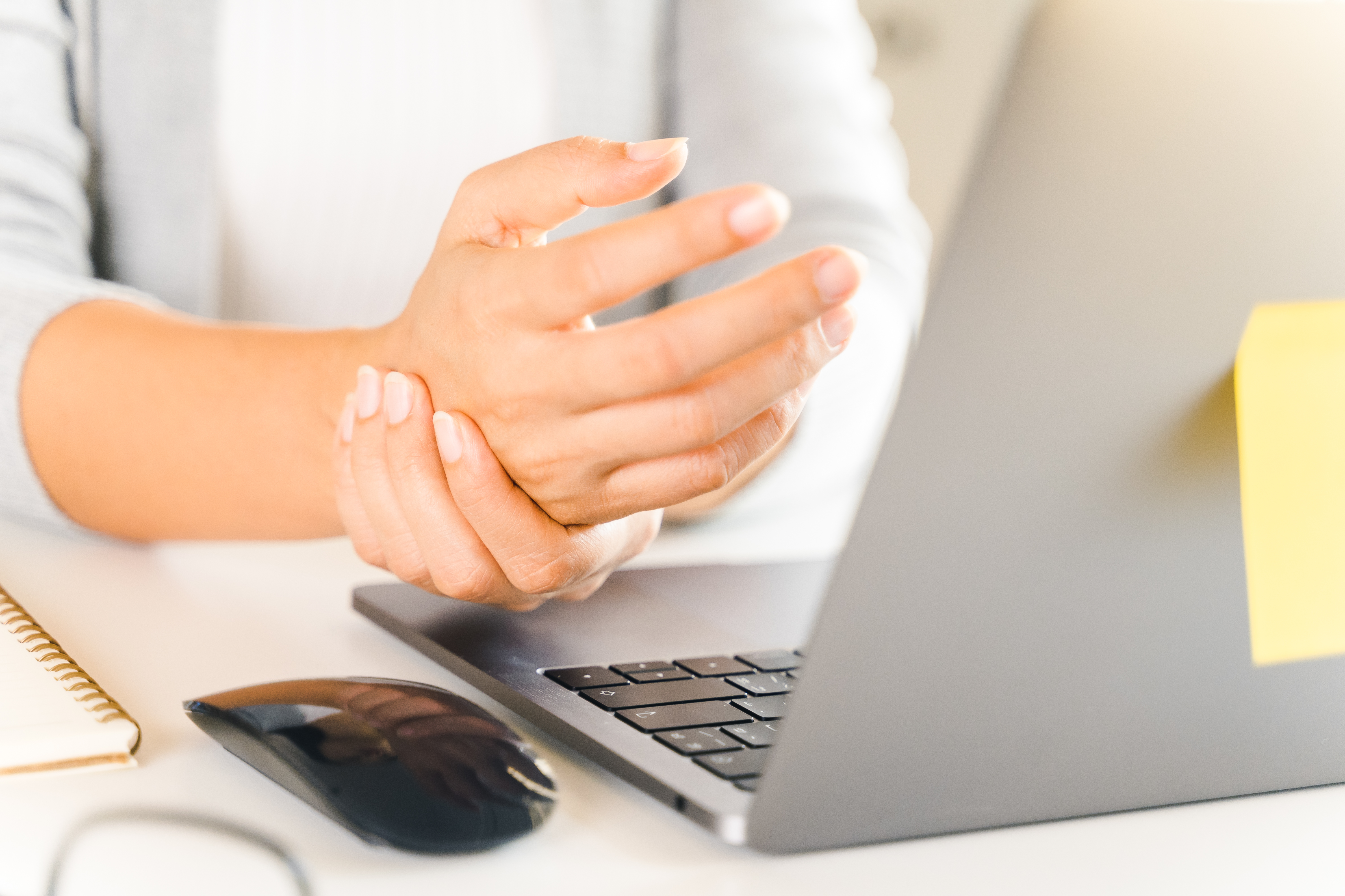
Since Covid I've worked from home most of the time. At some point my right hand started hurting — the small, everyday strain you don't notice until it's there. When I went looking for a side project to refresh my design practice, this one chose itself.
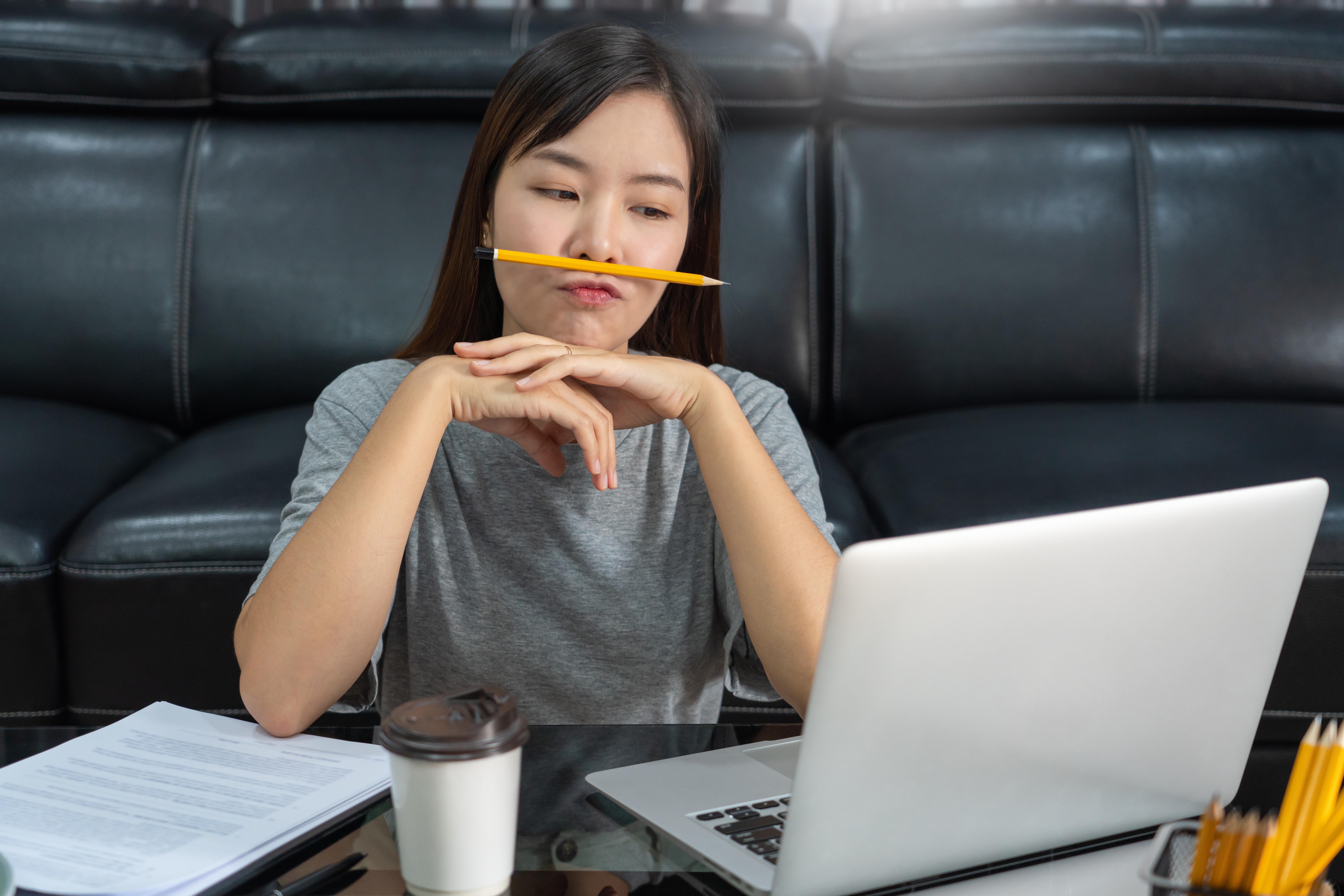
The remote day is longer, faster, and harder to unplug from.
- Longer hours at a faster pace.
- More interruptions — and more stress.
- A real difficulty unplugging at the end of the day.
Meet Kim.
Research needed a face. Kim is the persona I designed for — not because she's anyone specific, but because she collects the pattern the research kept surfacing.
Frustrations
- Burned out
- Can't find the time to take care of herself
Goals
- Eat regularly
- Stay focused with refreshing breaks
- Stay healthy and move around
A desktop companion, not a mobile app.
The problem is at the desktop, so the product had to live there. Mobile-only break apps get swiped away; the desk is where the strain happens and where the intervention has to land.
I scoped the product around a few things:
Always visible at the edge of the screen — shows current status, time to the next break, and opens the full app on click. Designed to be glanced at, not stared at.
A small pop-up with one warm prompt — let go of the mouse, blink, hydrate. Small enough to be shrugged off, specific enough to actually do.
A larger window opens with a quick stretch to follow along with — something to get you out of the chair for a moment.
Longer, guided breaks inside the app — stretches, breathing, audio mindfulness. For when you actually need to reset.
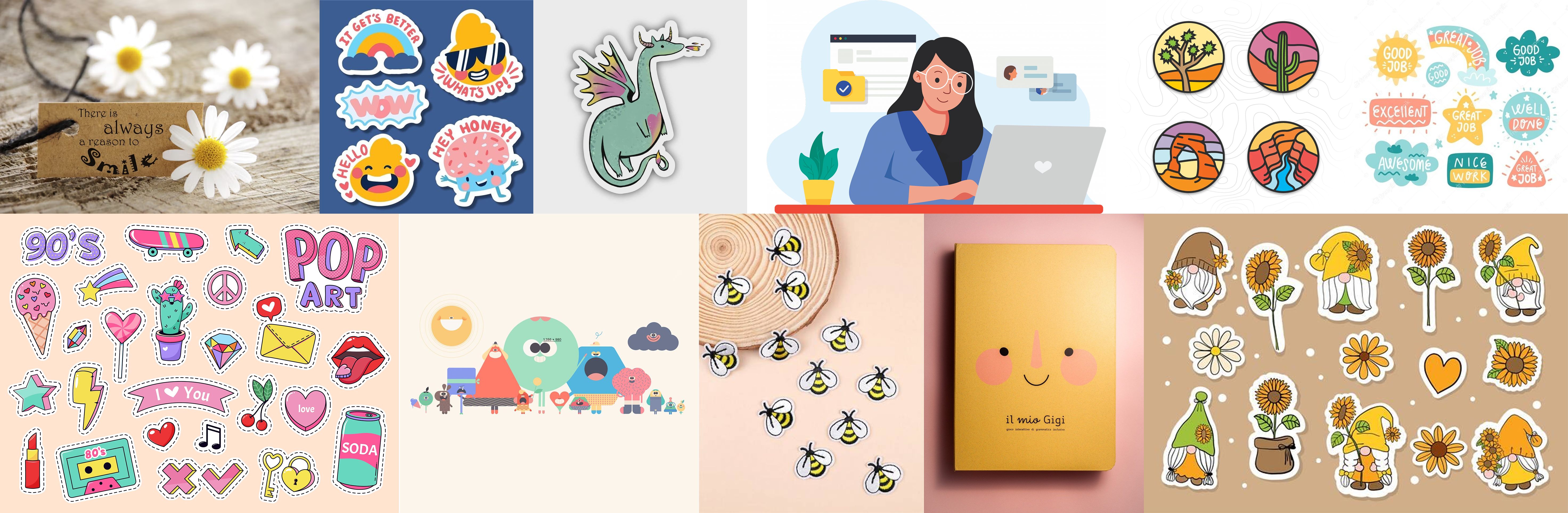
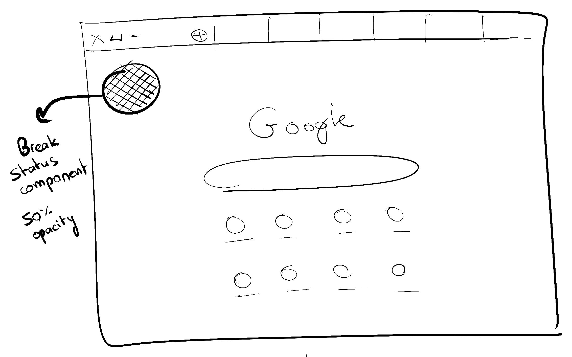
Warm, sticker-shop, slightly silly.
The references I pinned before drawing screens — stickers, storybook illustration, playful stationery, a wink of colour. A direction away from clinical productivity and towards something you'd actually want sitting on your desk.
A handful of what the desk-top would feel like, before it had to function.
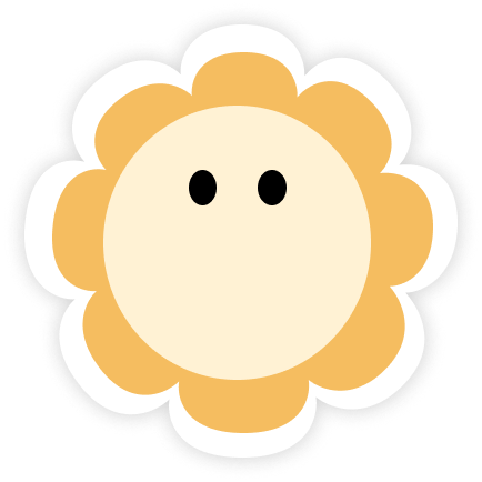
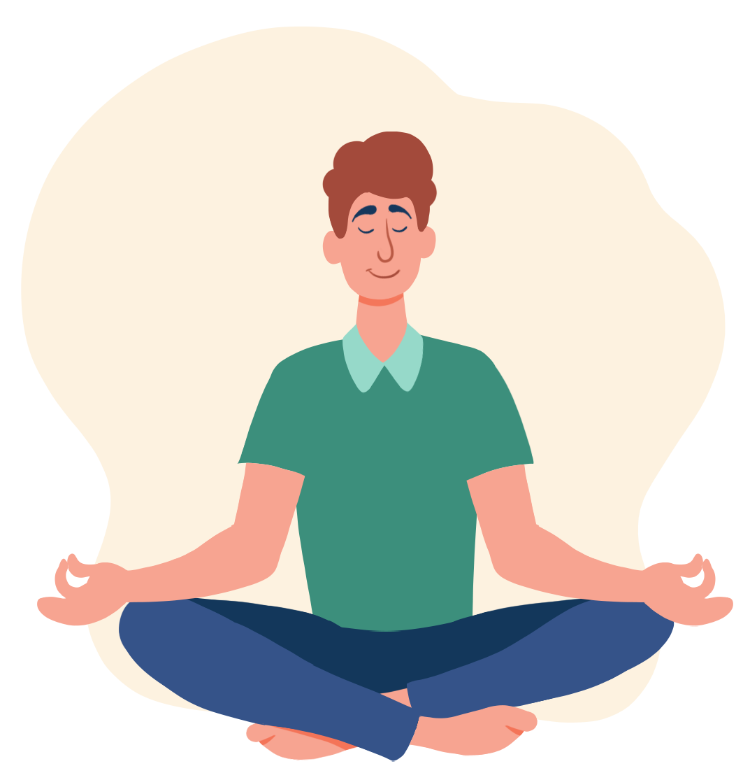
A flower, not an alarm clock.
Most productivity apps in this space look clinical — timers, red bars, stern reminders. That tone doesn't help people who already feel guilty for not taking care of themselves. It just adds another thing to snooze.
So the product needed a character before it needed features. I went exploring for a shape that would land the right vibe — not childish, but friendly.
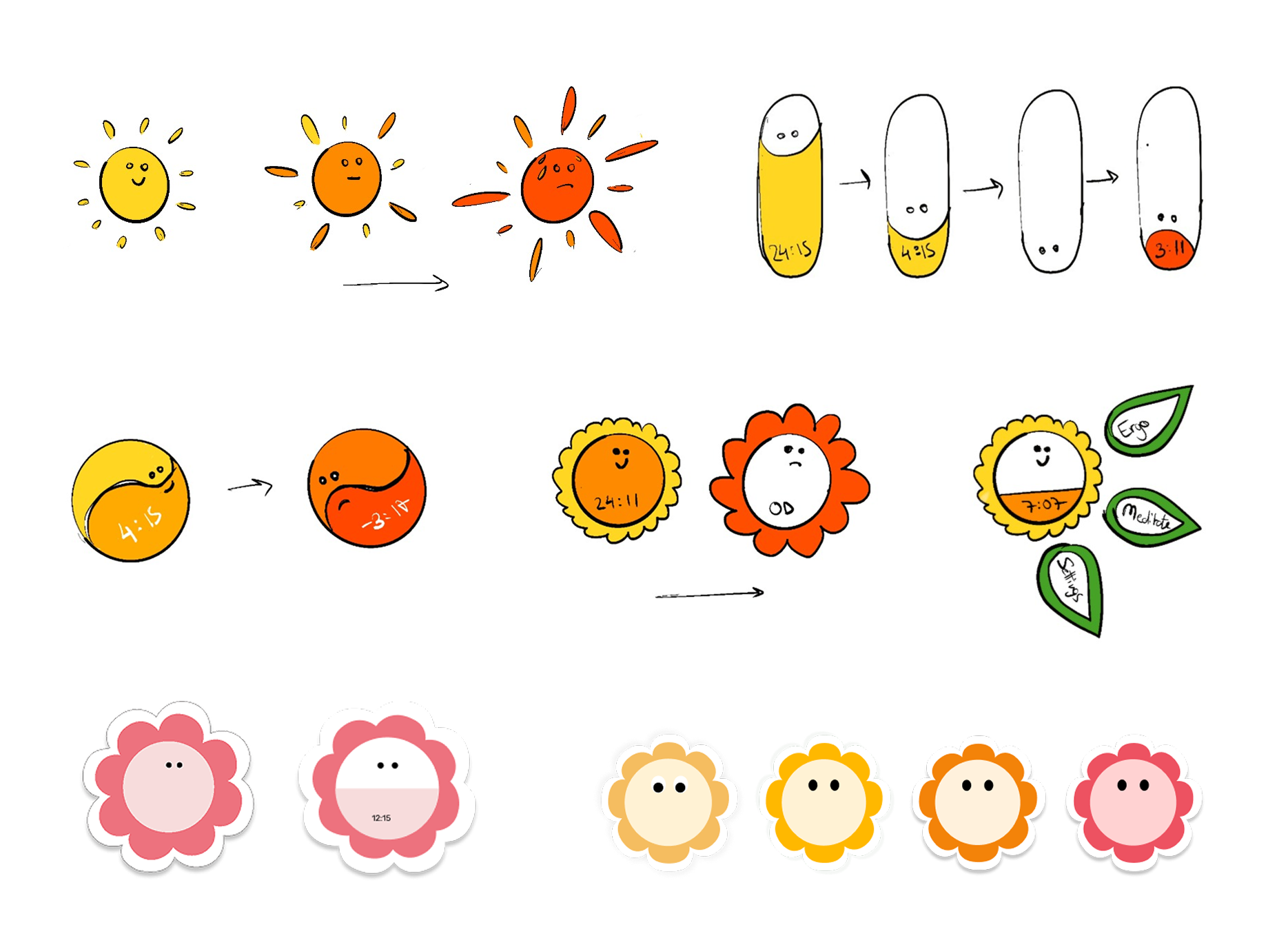
The status companion and the pop-up reminder.
These two components carry almost the whole product — a tiny character at the edge of the screen, and a small card that pops in every five minutes with one clear thing to do.
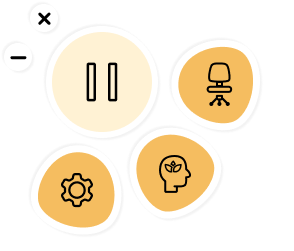
I sketched the status companion first — a floating peek of the mascot at about 50% opacity, so it's present but not invasive. It handles pause, countdown, and an overdue state.
Then, dozens of variations of the pop-up.
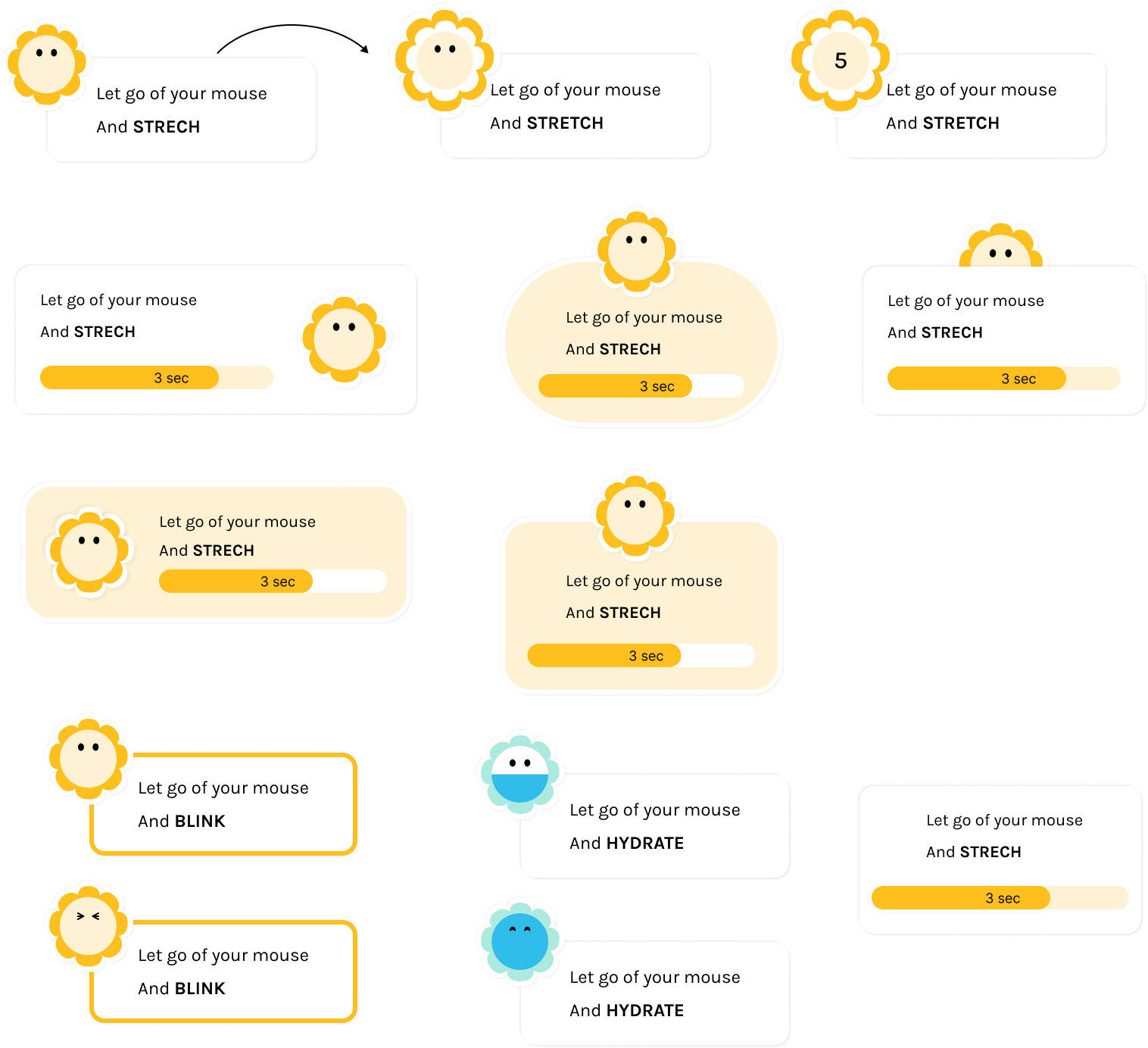
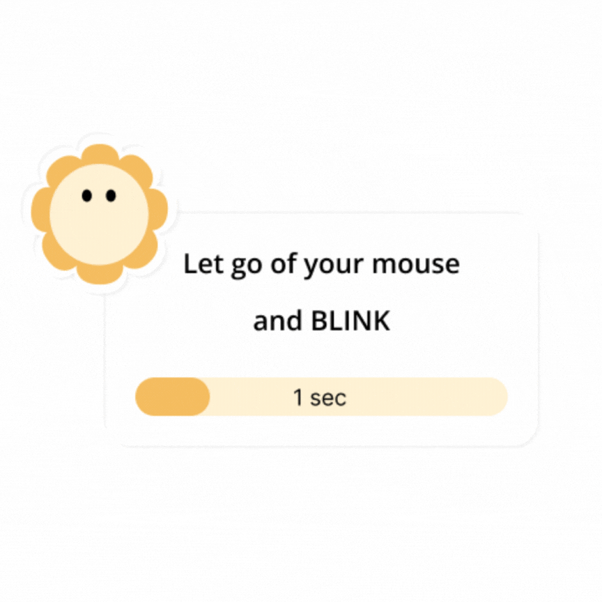
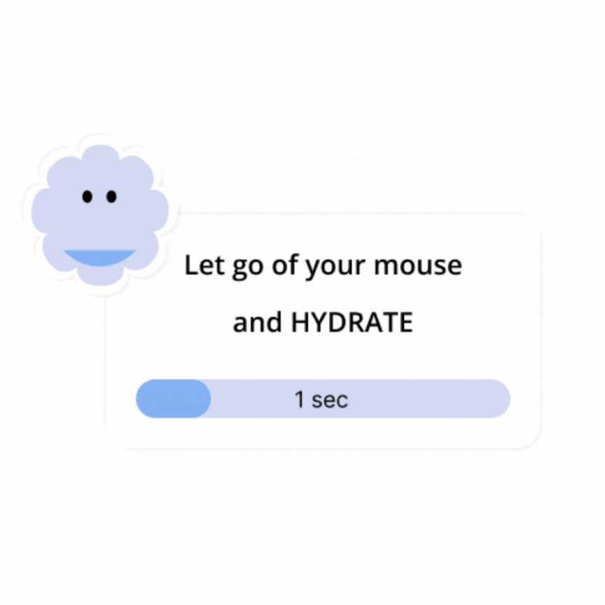
The same form, different prompts — one instruction, one countdown, the mascot already doing it.
From the companion to the full app.
Hover the flower and it opens into a menu — the three surfaces (Ergonomics, Mindfulness, Settings) each a click away. The big button pauses the app entirely; it's there for meetings and calls, where a pop-up would cut across something that matters.
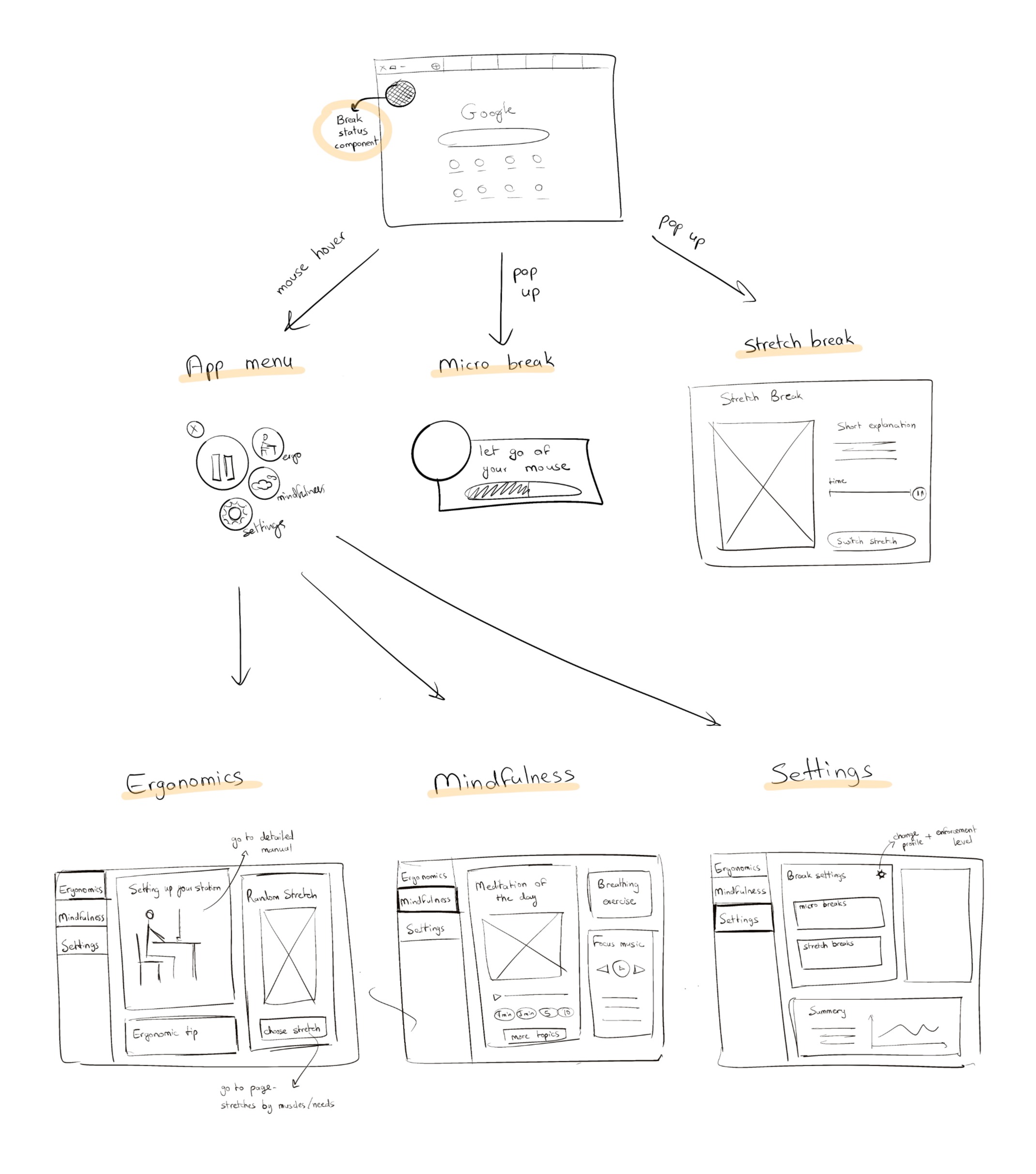
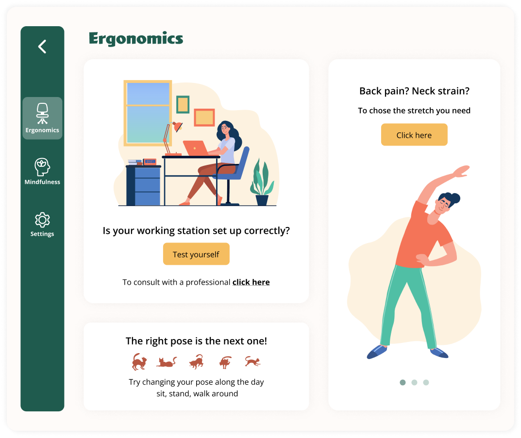
A shelf of ergonomic tips — not a checklist.
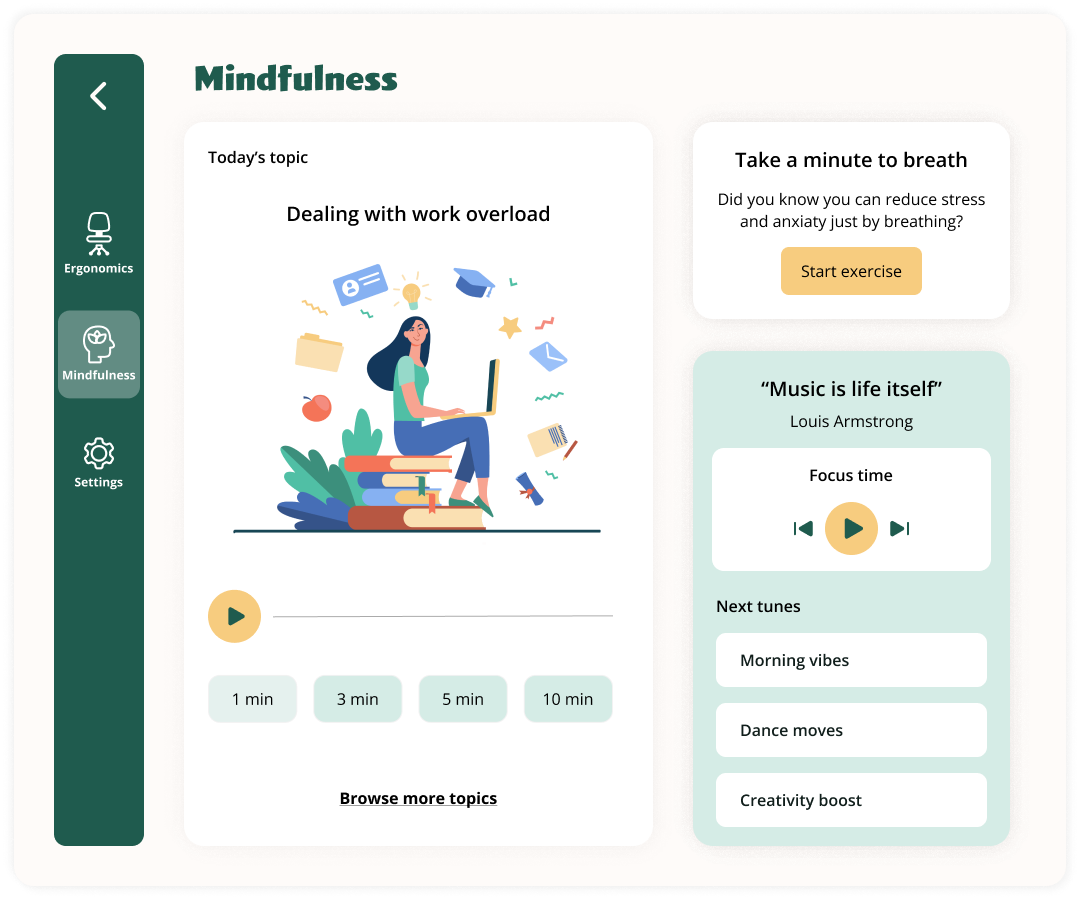
The Ergonomics surface is where ErgoFriend turns into a small reference. A place to browse — setup tips, posture guidance, bits of advice that can rotate and refresh over time. Each card pairs a tip with an illustration that keeps the tone inviting rather than corrective.
Design the break so it doesn't become more screen time.
Breaks without direction often become more screen time. Audio mindfulness turns the break into a real reset — short, eyes-off guidance that pulls users out of autopilot, helps them decompress, and lets them come back sharper.
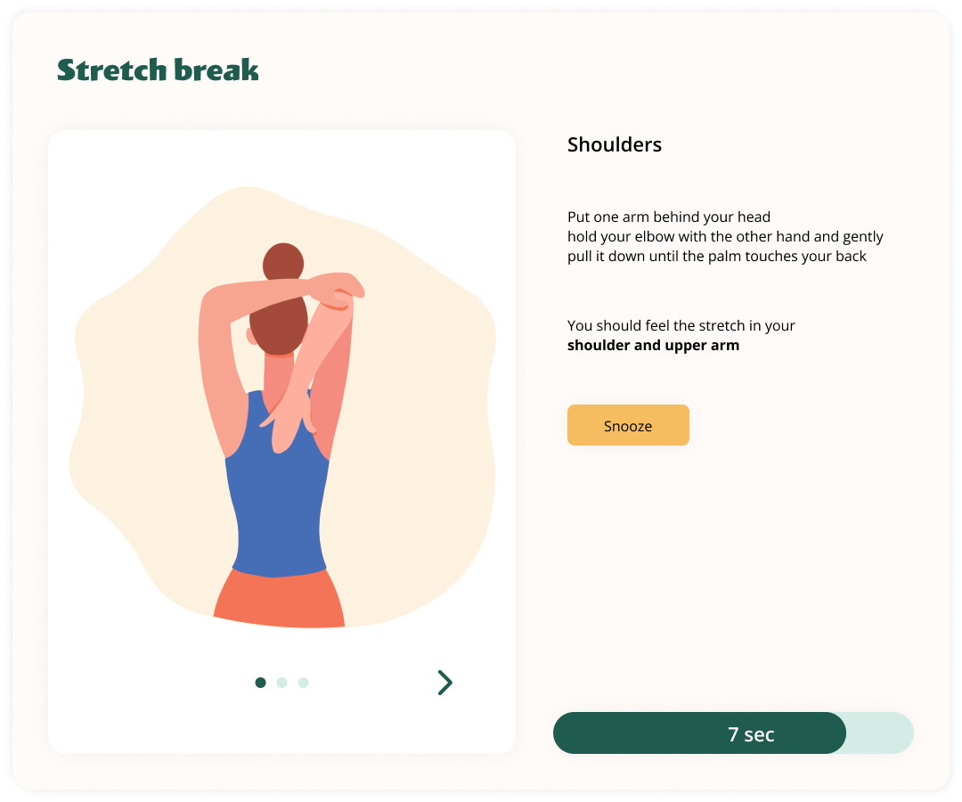
Stretches first — then space to breathe.
The stretch break runs for five minutes. A handful of short stretches first, each with a quick countdown — and then a quiet block of nothing. Room to stand up, walk around, or just look away from the screen. A snooze is there for when it's a bad moment.
Tune the breaks, glance at the week.
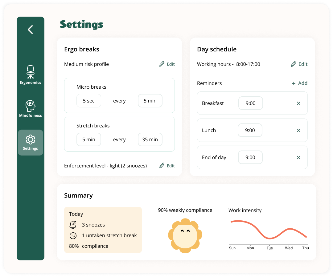
Two cadences to tune — how often micro-breaks and stretch breaks fire. Working hours and fixed reminders (breakfast, lunch, end-of-day) sit on the right as the structure of the day.
Plus a small compliance summary — not a guilt trip, a mirror. Snoozes, weekly rhythm, and work-intensity across the week. There if you want it, easy to ignore if you don't.
What I took away from this one.
ErgoFriend was the project where I let visual design lead. Most of my work starts with flows and structure; here I started with a character, a palette and a feeling — and let those choices pull the product behind them. It's a different muscle, and it's the one I wanted to build.